Veracode Defender – from concept art to final game
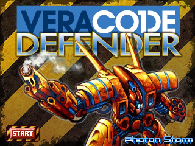
I’m pleased to say that our latest game is released. Veracode Defender is a Flash retro-styled tower defence game. It was a departure from our normal titles in that we made it specifically for a client, something we’ve never done before. It all came about via a casual tweet between ourselves and Melissa, a chiptune composer and NES fan (yay!) who works forVeracode. They were looking for a tower defence style game to help promote their security services. The deadline was a bit insane, but we pulled it out of the bag and delivered on-time. Having never written a tower defence game before it was a challenge, but a good one to under-take. And I now have a new-found respect for developers who churn out TDs by the bucketful, because believe me – balancing those game is far from easy!
The graphics were created by Diego, who I had met at Aardman where I work. He was a matte painter there, creating stunning backdrop scenery for our latest film The Pirates! In an Adventure with Scientists (do watch the awesome trailer! the film is out this month). Anyway he felt like taking on the challenge of moving from gigabyte sized Photoshop files down into 16×16 pixel sprites. So off we started and literally 10 days later the game was finished.
You can get some developer insights from me on the games page itself, but what I wanted to show here was the graphical evolution of the game from concept to final pixels:
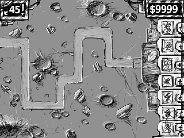
Diego and I spoke about how the screen would be structured, I gave him some rough dimensions and he produced this first-pass concept sketch. We wanted the turret menu down the right-hand side, your available funds above it and the wave counter on the far right. The robots would attack from the left and be trying to get to your base on the right. The game turned out remarkably similar to this initial sketch, but went through a few iterations first. Especially the robots …
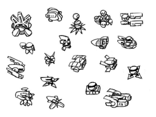
The first set of robots were drawn from a 2.5D perspective. Just to give an overall idea of their shape and function. Diego then narrowed it down and took them onto a complete overhead top-down view point:
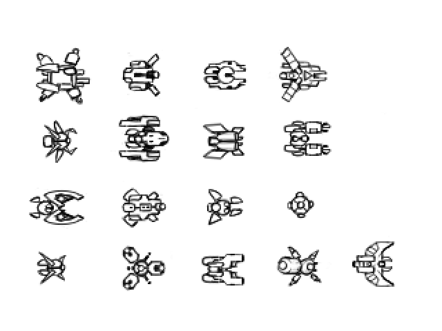
From above some robots instantly lost the appeal they had from a 2.5D perspective. We knew we only needed 6 of them and refined them yet again to produce the final set:
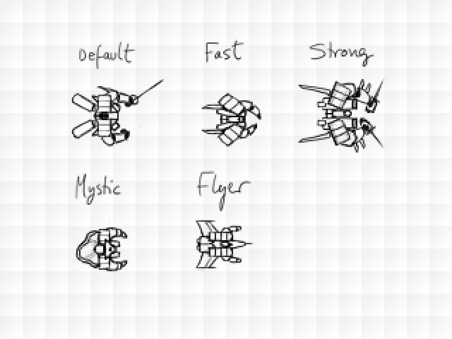
Here you can see that they are carrying swords. The reason for this is that originally we wanted them to be robotic ninjas. That fitted well with the thought of a security company who protect against ninja hackers! So at this stage the swords remained in-tact. They were added to the original concept and it was then coloured in to set the overall tone and palette we’d eventually use:
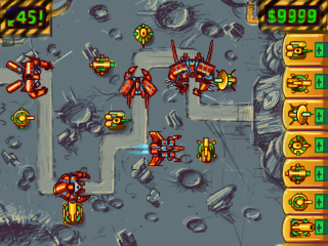
As you can see the robots and turrets are massive! The original sprites were drawn quite close to this size, but we soon found when we played the game that they just didn’t work. When you’ve got such huge creeps you can’t send massive waves of them and it becomes a lot less about the strategy of protecting your base. So everything had to be shrunk down to fit more in line with the 16×16 grid we were using. Here is an early build in-game shot:

You can see that the robots (although badly overlapping here) still retain their ninja swords! But the turrets are now much more accurate in terms of scale with the overall map. The jump from here to the final game wasn’t that far:
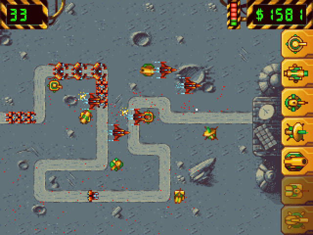
You can see subtle UI changes. The side-bar has been shrunk back and a health meter has been dropped in next to your money. The turrets used on the side-bar are the original sized turrets we had in the early versions of the game, before they were shrunk down to size! By dropping down in scale it meant we could get a whole load more robots on-screen and just a load more carnage. The robots themselves use a 16×16 tracking rectangle that follows the path and are just offset on-top of that, as they vary in size. We didn’t want to drop the “big robot” feel entirely, so towards the middle of the game this mammoth walks on:

And you’d better hope you’ve got your defenses sorted by that point 🙂
There are lots of things I’d like to do with the game to improve it of course. The ability to upgrade and sell turrets for example, lots of different maps to play on and I also really wanted robots that could destroy your turrets! But you have to draw a line somewhere, and a really short deadline enforces that for you which means you work with what you’ve created so far, and don’t let feature creep sap your enthusiasm for finishing.
I hope you found the sketches interesting. And of course feel free to play the game too!
Posted on March 1st 2012 at 11:08 pm by Rich.
View more posts in Games. Follow responses via the RSS 2.0 feed.
Make yourself heard
Hire Us
All about Photon Storm and our
HTML5 game development services
Recent Posts
OurGames
Filter our Content
- ActionScript3
- Art
- Cool Links
- Demoscene
- Flash Game Dev Tips
- Game Development
- Gaming
- Geek Shopping
- HTML5
- In the Media
- Phaser
- Phaser 3
- Projects
Brain Food
