16×16 Pixel Art Tutorial
Apparently pixel art is cool once again, and if you are reading this blog, chances are, you like pixel art. As my first actual article on the site, I thought I’d make a little tutorial on how to pixel your own 16*16 sprite, that you can use as a favicon for your website or game. There are many ways to go about pushing pixels, and this is just one of them. Sadly, this tutorial will not teach you how to draw or come up with nice ideas, sorry. Also I will not go into program-specific details, you need to have some basic familiarity with the software you want to use.
Fire up your app of choice (mine is GraFX2, but you may be more comfortable with Photoshop, GIMP or what-have-you), and make a new 16*16 pixel document. Done? OK, now take my hand and I’ll walk you through the steps of pixeling a frog.
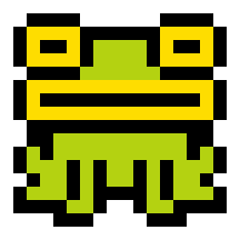
Step 1 – OUTLINES

What to do:
Using black colour, make a little drawing inside the bounds. Now, 16×16 pixels can seem like a very small space, and it is, but it will teach you the first lesson of pixel art, to make each pixel count.
Important:
Make sure your drawing is fully articulated and readable at this stage. If you start with a bad drawing, no amount of polish will be able to save you.
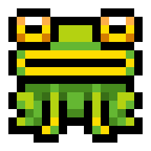
Step 2 – BASE COLOURS

What to do:
Colour inside your drawing, just set the basic colours and avoid any shading
Important:
Make sure your base colors work well together and are also bright and vivid enough, at this stage the drawing should be even more readable than the last stage, not less.
Step 3 – SHADOWS

What to do:
For each of the base colours from the previous step, make one darker color and use it to add shadows where needed. For simplicity’s sake, imagine your light is coming directly from above.
Important:
Always review what you’ve done. Don’t be afraid to change your base colours if, after adding shadows, you find them too dark.
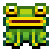
Step 4 – OUTLINE COLOUR

What to do:
Add some colour to your black outlines. Add as many new colours as you need. Generally, you’ll want your outline colours to be a darker version of the fill colour.
Important:
One neat trick is to use outline colour to imply shading as well. Observe the outlines of the frog’s eyes, notice how upper parts are fairly bright, while lower lines are black.
Step 5 – ENJOY (and potentially boast)
Hopefully your little sprite will end up looking like a tiny toy. If it looks terrible try to figure out where you went wrong. Perhaps you were too ambitious and wanted to put too much detail into such small space? Keep in mind that it is always good to simplify the shapes and focus on giving them volume. Perhaps you are just hopeless and the more you work on it, the worse it looks? In that case there is only one thing to do: take a break and feast your eyes on some good pixel art until you regain your vigor. Once you have tackled the challenges of pixeling, you will be able to better analyze other people’s work and identify what makes it good. Conveniently enough, here are some more sprites (one of which is the new favicon for this site) all made using the delicious recipe described above.
Happy artings and see you soon!
i
Posted on September 27th 2011 at 11:16 pm by iLKke.
View more posts in Tutorials. Follow responses via the RSS 2.0 feed.
Make yourself heard
Hire Us
All about Photon Storm and our
HTML5 game development services
Recent Posts
OurGames
Filter our Content
- ActionScript3
- Art
- Cool Links
- Demoscene
- Flash Game Dev Tips
- Game Development
- Gaming
- Geek Shopping
- HTML5
- In the Media
- Phaser
- Phaser 3
- Projects
Brain Food


